10/18 Lab #9: Results and Figures

Purpose
The purpose of this lab was to continue to compile our data and draw results from what the charts display regarding the effects of PPT on Tetrahymena cells. We worked with Excel and broadened our knowledge of error bars, graphs, and charts. In a broader scope, we continued to work on our end research paper by writing our results section. This lab also posed some hard situations that we learned to overcome, expanding our growth mindset.
Procedure
- Open up Excel
- You will be creating three charts- 1) cell count, 2) optical density, and 3) your specific assay- so compile the items relating to these topics onto one excel sheet for easy access.
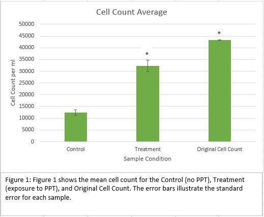
- Begin by creating the chart for the cell counts. Create three columns with control, treatment, and original count. Below each title, enter the mean and the standard error (both of these values can be found under the descriptive analysis data you collected last week).
- Highlight the titles and their means and then click up to recommended charts. Find the vertical bar graph and select. Make sure to add a chart title and titles for both the x and y axis.
- Now add error bars. You can do this by going to “add chart elements” and finding “error bar”, then selecting a custom value. Use the standard error as your input and output. Then check back to the descriptive analysis and see if the F-Critical is bigger than the F value. If yes, then add a * to the top of the bar in the graph. Do this for each sample.
- Create a text box underneath the graph and type a short explanation of what the graph is about as well as a graph number (this number is what you will reference in your paper).
- Repeat steps 4-6 for the Optical Density and Behavioral Assay that you completed.
- Once you have completed all three charts, save them as JPEG files to your computer.
- Now move on to your paper. Here, rewrite your Materials and Methods with the comments that came with it in the submission and add the Results section. Make sure to not fall into the Discussion section (we will get there later). Some key points to follow are, DO compare your results, point out key data points, and summarize your charts but DON’T restate your charts or interpret them.
- Add your photos into the paper and make sure your paper is coherent and symmetrical.
Data
Cell Count Chart~
Optical Density Chart~

Swim Assay Chart~

Storage
Since we were again in the computer lab, we did not have anything tangible to store. However we did store our charts as JPEG photos. We turned in the cell count and optical density charts as a group for our QTM and turned in our paper draft with the addition of the Results section.
Conclusion
This lab was again very fasted paced which called for a lot of fast thinking, decision, and action. This time-crunch resulted in some complications as we had to re-do a lot of our charts multiple times because we kept remembering more things that should have been added. The error bars proposed a hard challenge but in the end we were able to figure them out and get our charts turned in on time. For the future, I think I will try to understand of all the tasks required of me before I dive in, because my process of working quickly and efficiently, turned into more back tracking than forward progress because more points kept being added that I had not considered the first time through. Overall though, I think we made some good progress in our paper by adding the Results section and we are starting to see the finish line up ahead for the final project turn in and presentation. I look forward to correcting my mistakes and bettering my Excel skills as we close in on our Tetrahymena Experiment.