Lab 9: Creating Figures Using Excel 10/19/17

Objective:
The goal of lab today was to learn how to correctly create a figure using excel. Student needed practice using the Excel graphs and how to manipulate them in a way that they portray all the information that is necessary in order for individuals to interpret the information presented. The main objective of today was to learn how to use Excel better and more efficiently when interpreting data.
Purpose:
The purpose of today’s lab was to ensure that we are prepared to write our research papers with figures that have the correct information and are formatted in the best way. This lab is very important, not only for this experiment and course but for any future participation in research. Knowing how to use Excel will help to interpret data to create even more data that could lead to a researcher knowing whether or not they are able to reject or fail to reject their null hypothesis.
Procedure:
1.) Open the Excel spreadsheet containing all of the class data.
2.) Record all of the data pertaining to the students who were testing the same dilution factor as your group.
3.) Open a new blank excel sheet and label two adjacent columns “treatment” and “control”. Then record all of the data from each trial into their corresponding columns on this new spreadsheet.
4.) Once all of the data is recorded, take the average of each one.
*The average is necessary in order to create a wholistic view of the data collected.
5.) Within Excel, click “Insert” located on the top and in the drop down menu, click “recommended charts” which will give a variety of graphs that interpret in different ways. Choose the bar graph because it is the best way to interpret this data.
6.) After selecting the bar graph, move the cursor over to the chart and click it. Then in the top right corner select “add chart element” and scroll down and select to add error bars.
*The information that is needed for this step was calculated in the F-test as standard area for two variables.
7.) Within the “error bars” tab, select “more options” then insert the standard error manually based on the descriptive statistics calculated from the previous lab. This process will place error bars on the two variables shown on the bar graph.
8.) In order to change the color and style of the bar graph, double click on the bar graph and you can select “add chart element again” and from their you can add both vertical and horizontal axis titles.
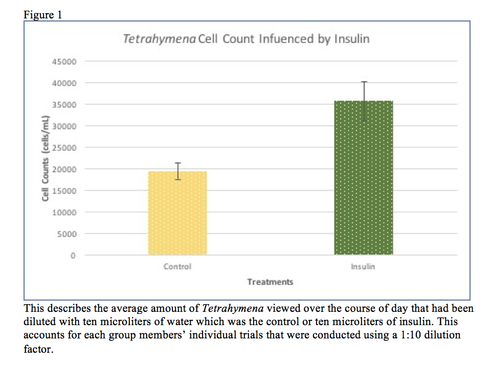
9.) Label the vertical axis “cell count of tetrahymena (cells/mL)” and then label the horizontal axis “treatments” (label the individual bars “control or water” and “insulin” according the corresponding data presented).
10.) In the top left corner next to the “add chart element”, there is an option to select “quick layout”, if you select this option, then click the seventh layout format from the top and will automatically provide space for a title, and a space to label both axis.
11.) To complete the figure, save the chart as an image (jpeg) and place it in a word document to add a figure caption, then save the whole document and your figure is complete.
Data/Observations:
Current Storage:
During this lab and a few previous labs, we have been working in the computer lab and there are currently no trials or experiments being conducted at this time which would mean “current storage” would not be applicable while as we are writing drafts for our research papers.
Future Goal:
This lab will definitely help us for conducting research in the future because learning how to properly document our findings and results will ensure that others can read our reports and be able to recreate this experiment for future questions that arise regarding ciliates intake of insulin and how it affects them. Learning how to use excel will definitely ensure that we are future researchers will be proficient in not only conducting research but documenting our findings properly.