October
19
QTM #9
QTM #9
10/19/2017
Purpose: The purpose of this lab activity was to become more acquainted with using Excel and produce a clear and informative graph that conveys the message lying behind our data. The figure must include the data from the entire treatment group and this will be presented for feedback.
Procedure:
- Make a bar chart (or any other chart that would represent the data better)
- Make a table of the treatment and control values.
- Find the average values for the control and treatment values and place these numbers in a separate column.
- Create a bar graph by clicking on recommended charts.
- Add axis labels and a title by clicking on chart design and add chart elements.
- Change the colors of the graph by clicking on change colors.
- Add Standard Error Bars.
- Click on add chart elements – error bars – standard error.
- You may have to also perform a new data table to find the standard error.
- How to add an asterisk to point out significant differences.
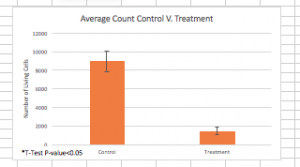
- Insert a text box and use the data from the T-Test to determine if we were able to refute the null hypothesis. Because the P-value was less than 0.05, we were able to reject the null hypothesis.
- Save the work as a picture in the form of a jpeg.
- Insert into your report.
- Add a caption to your figure in Word.
The figure above shows the average values for the treatment and control cell counts. The standard deviation, as calculated previously, is also shown in the bar graphs.

