October
19
Figures 10/19
Purpose: The purpose of this lab is to create a figure that represents our results.
Procedure:
- Enter all of the data into the correct column.
- Click on the insertion tab
- under Extra Graphs, then statistics is the box plot.
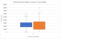
- Using only the 1 microliter control and treatment group, use the box plot to show the data.
- click on the graph tab
- under Graph Title, change the box plots title to “Tetrahymena Ciliate Counts: 1 microliter”
- Under Graph Axes horizontal, change the axis title to “Control vs Treatment”.
- Under Graph Axes vertical, change axis title to “Ciliate Count”.
Figure a
Conclusion: The graph shows that the blue bar is control and the orange bar is the treatment group. This graph proves that the number of tetrahymena increased from the treatment of insulin, since the treatment bar is higher than the control bar. The blue and orange dots represents the outliers.

