Lab 7: Results and Analysis
Taylor Hutcheson
Date:
23 February 2017
Title:
Results and Analysis
Goals:
- Collaborate with your group members so as to come up with the most effective way to visualize and portray the data you have all recorded.
- Learn how to activate and use the data analysis tool pack in Microsoft Excel.
Procedures:
- Observe other presentations and assist in the critique of their graphs.
- Present our own group’s graph.
- Enable the data analysis toolpack in Microsoft Excel.
- Use this toolpack to generate desired statistics about selected groups of data regarding the cell counts of Tetrahymena cultures.
- Use this data to create bins.
Observations & Data Analysis:
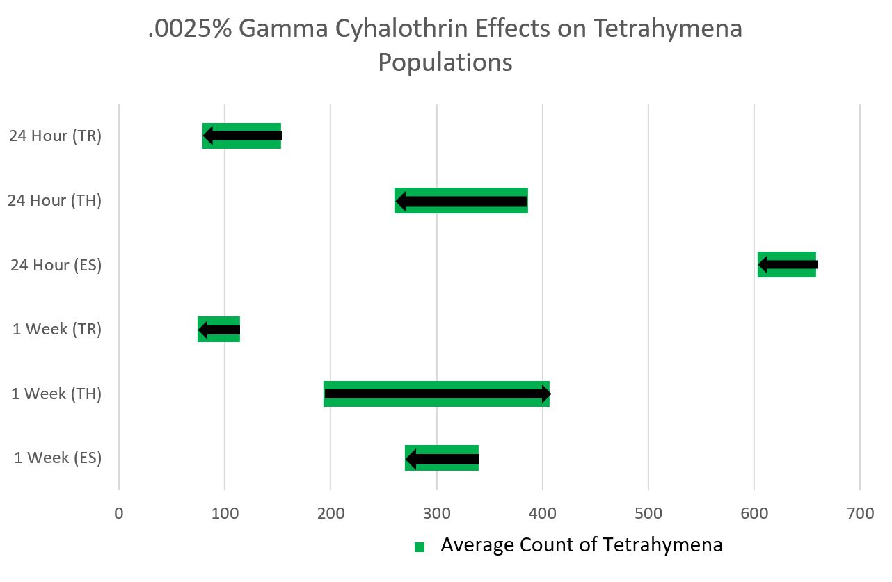
It was noted during this meeting that a line graph would not be appropriate for our range of data as it traditionally has to do with change over time, whereas the data we have collected does not have a constant change. This is important to keep in mind in the future.
Our group initially planned on doing a bar graph, however, with the large range of data collected between the three of us, we found this method to be too cluttered to fit onto one graph. This appears to have been a problem with other groups, as well, as those who decided on the bar graph ended up with many bar graphs.
Though the graph our group came up with ended up something somewhat out of the box, it is important to keep in mind when moving forward that, as was mentioned in class, “there is always a better way to graph it.”
Next Steps:
The next steps will include the implementation of professional data analysis, especially when it comes to writing scientific papers regarding our research.