
Project Title: Visualizations from the Baylor Religion Survey Wave V
Overview of Trend Lines: Choosing the best trendline for your data
Question Prompts:
- How many discrete answers are given for the question: How much would you say you trust people in general?
- How many survey respondents had 8 children at the time they took the survey?
- Is there a Direct or Inverse relationship between How religious do you consider yourself to be? and How old were you when your first child was born?
- Is there a significant relationship between X-AXIS: How often do you attend religious services at a place of worship? and Y-AXIS: How many hours did you work last week?
- What is the correlation (R^2) between X-AXIS: How often do you attend religious services at a place of worship? and Y-AXIS: How religious do you consider yourself to be?
- Of the various groups listed in the question Do you think of yourself as Republican, Democrat, or Independent?, which group has the highest correlation between X-AXIS: How spiritual do you consider yourself to be? and Y-AXIS: Overall, how satisfied are you with your sex life?
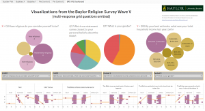
Description: This exploratory visualization is designed to compare relationships between any two variables from the Baylor Religion Survey. (At the moment, the only available questions are single multiple-choice questions and not multi-question grids.)
Instructions: There is a dropdown menu each for the X-AXIS and Y-AXIS with packed bubbles showing frequency of the ordinal values within each selected axis parameter. Below, there is a scatter plot for the selected x- and y-axis and a regression line. Mouse over the regression line to view the linear equation, p-value, and r-squared. There is also a Control For… dropdown for categorical variables. Selecting a Control will enable the pie chart to show relative responses and will divide the scatter plot into each unique response. The two packed bubbles and the pie chart also act as a filter and can be used to filter all other visualization objects.
Researchers Involved:
- Joshua Been, Baylor Libraries
- Dr. Jerry Park, Baylor Sociology Department
Procedure Used to Create Visualization:
- Use SPSS to convert statistical files into Excel Workbook
- Create table including the raw responses and the coded responses
- Import into Tableau
- Create the five visual objects (two packed bubbles, two pie charts, and one scatter plot with trend line)
- Create dashboard and publish